Redesigning a study abroad website to improve findability, trust, and long-term scalability.
Researching study abroad opportunities often begins online. Users look to program websites to answer fundamental questions about safety, structure, and credibility, while also trying to imagine what the experience would feel like. Without clear organization and trustworthy storytelling, that early research can quickly become overwhelming.
GPI US’ original website for JapanBound fell short of supporting this early research process. Confusing information architecture made key details hard to find, while outdated design patterns, stock imagery, and accessibility gaps undermined trust for students, families, and school partners.
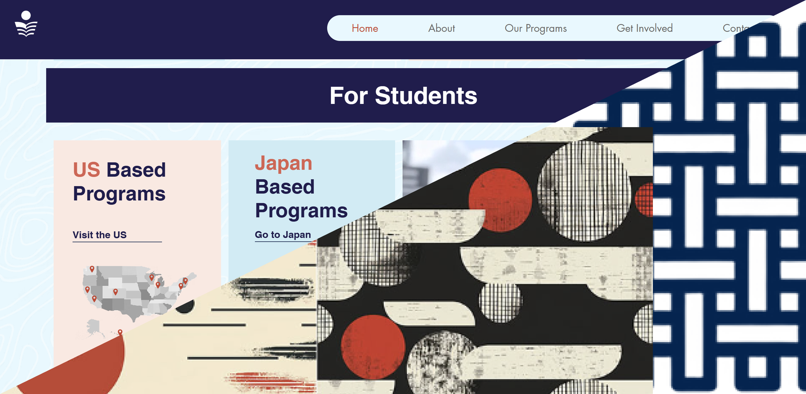
The original homepage was published in Japanese, which immersed Japanese language students in the prospect of participating, but often disoriented parents.

A screenshot from the original homepage of the JapanBound website.
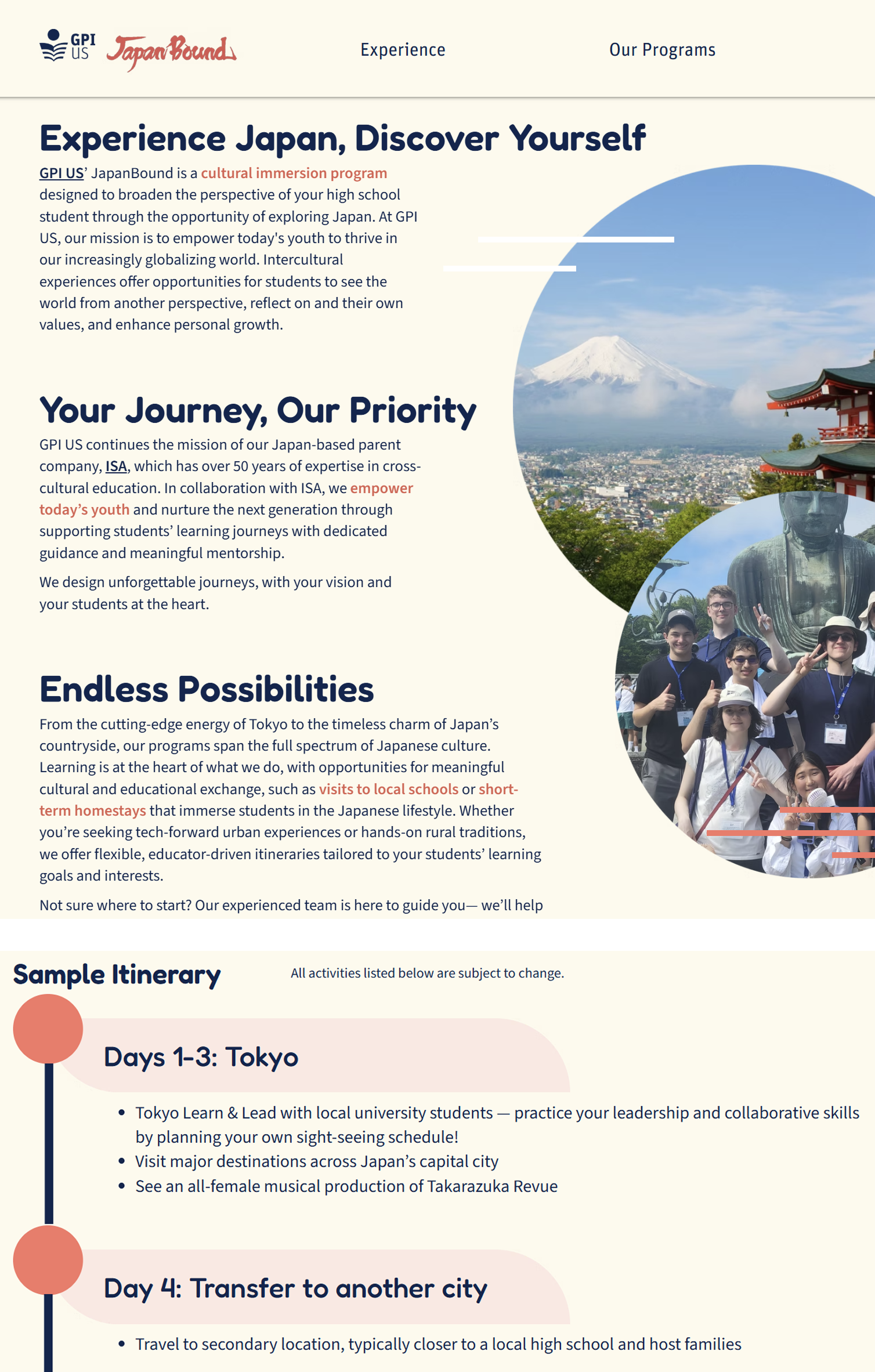
Stock images across the original website were pretty, but failed to create an authentic image for the program.
Because students and families were often encountering the program for the first time, the website needed to support quick orientation and confident exploration. The original information architecture required users to piece together program details across multiple pages, increasing cognitive load and making it harder to find essential information during early research.
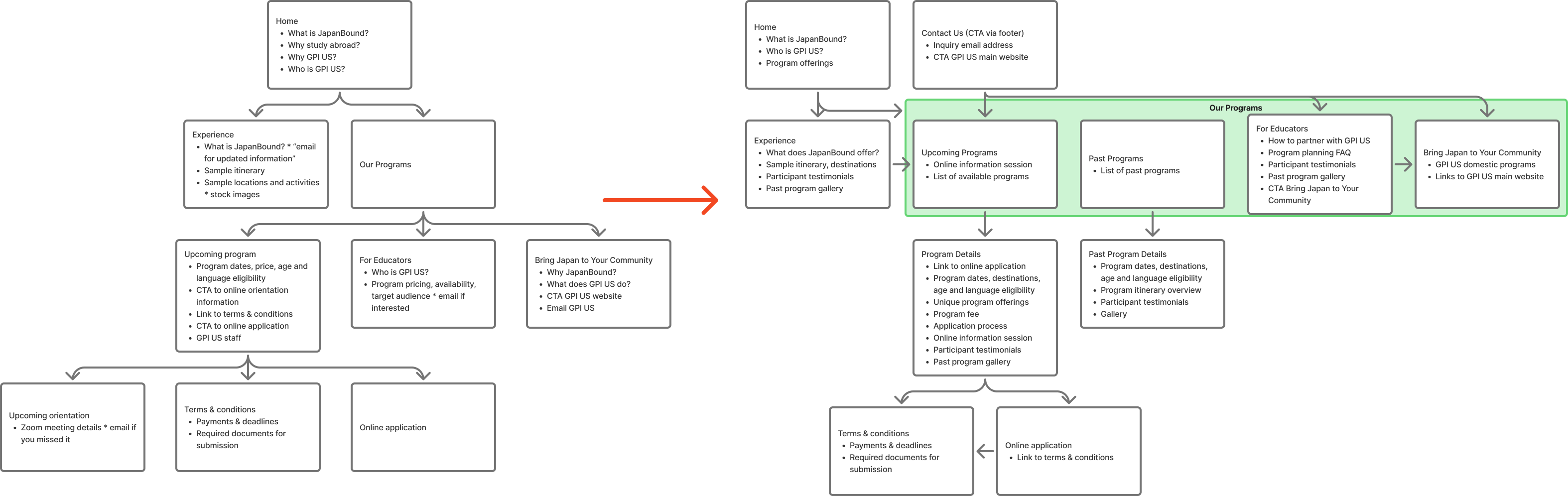
Click image to enlarge. Diagrams visualizing the information architecture of the JapanBound website before (left of the red arrow) and after (right of the red arrow) the redesign. The original website required more clicks to reach important information and encouraged emailing the program organizers for information. The redesign makes more information accessible within fewer clicks, centralizes important information on single pages, and frames contacting program organizers as a next step for getting involved with the program.
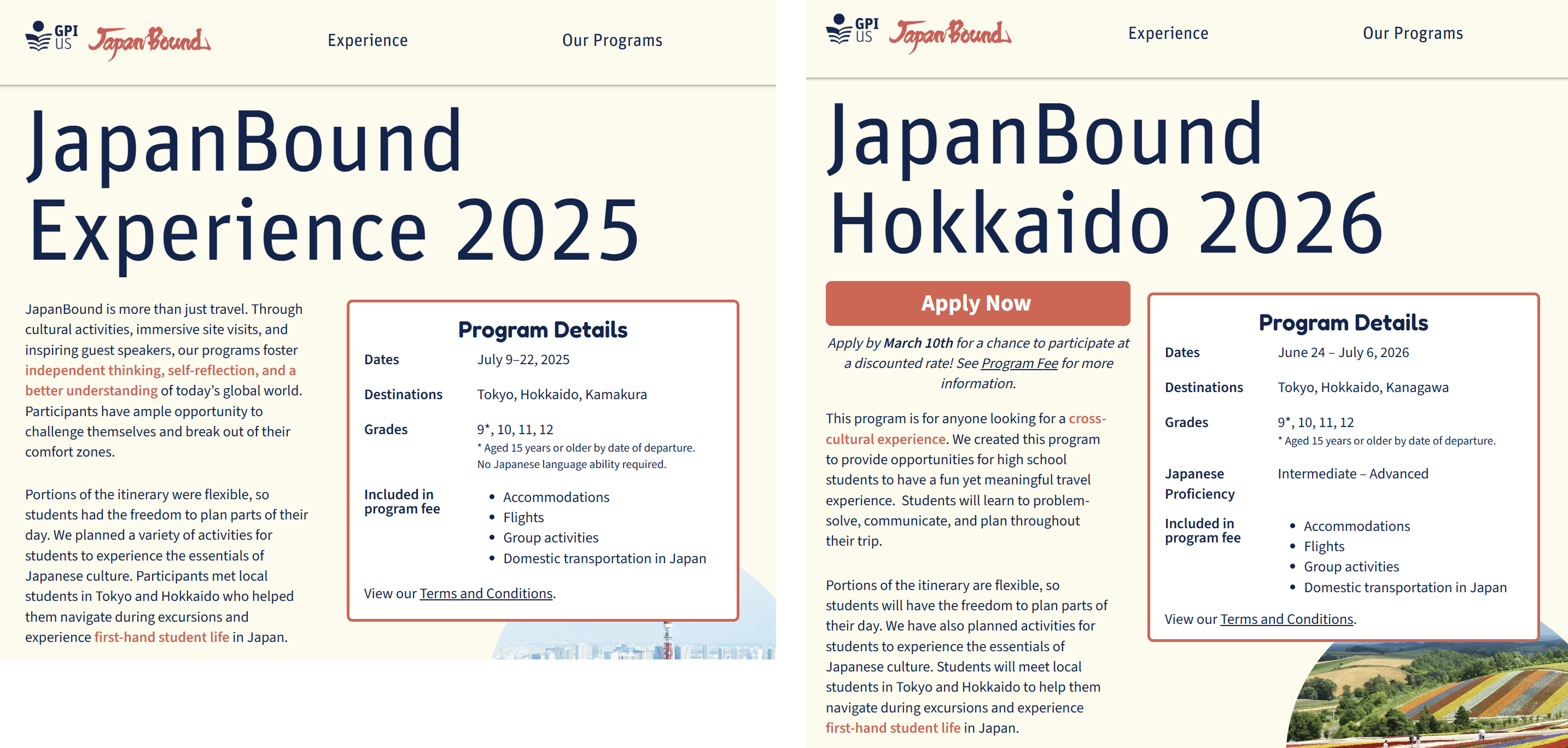
To address this, the redesign focused on clarifying navigation and restructuring information architecture around user goals rather than internal program structure. Program details, organizational context, and past experiences were clearly separated and labeled, allowing users to predict where information lived and move through the site with greater confidence.
While the number of steps to reach certain pages remained similar, clearer labeling, logical grouping, and consistent page structures improved content findability and reduced wayfinding friction throughout the site.
For a high-stakes decision involving international travel and minors, visual consistency and authenticity play a critical role in building trust. The original website relied on outdated styles and stock imagery, which made it difficult for users to assess the legitimacy of the program and imagine the student experience.

The original website was dominated by serif fonts and featured image watermarks, creating an old-fashioned appearance with poor readability.
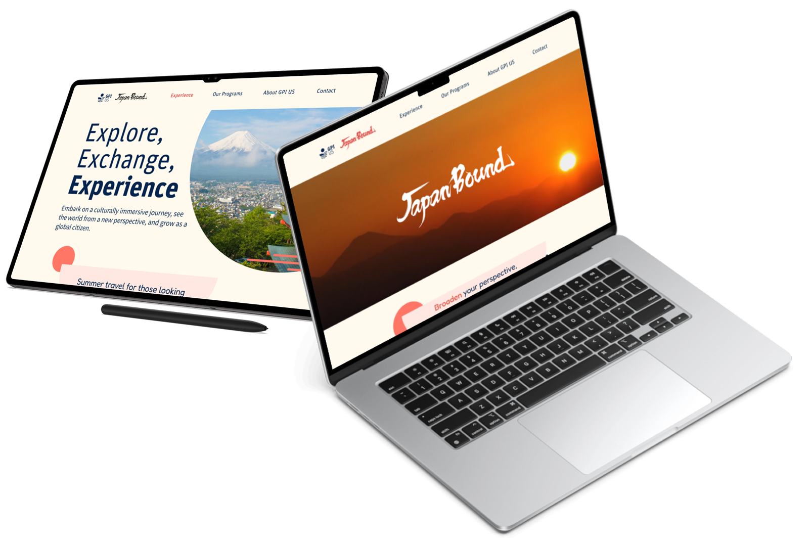
The redesign introduced a cohesive design system with recognizable visual patterns, consistent typography, and reusable components across all pages. Real photography from past programs replaced stock imagery, grounding the experience in authentic student stories and reinforcing the organization’s credibility.
Click images to enlarge. (Left) The design system utilizes GPI US' official color palette and takes inspiration from modern Japanese graphic designs. (Middle) Examples of the design system's visual elements in action. These visual elements are used throughout the redesigned website. (Right) Similar content are presented with consistent layouts, making information more predictable.
This system created a more professional and trustworthy visual language while also enabling scalable updates for future programs without compromising consistency.
Visit JapanBound.net
